

When comparing an online casino, the easiest way to overlook important differences is to focus only on the game catalogue. Navigation affects how quickly you can find rules, promotions, account controls and transaction records, especially when a site combines casino, live-dealer, sportsbook and esports sections. The Canadian-facing information for lucky hills casino provides a useful example of how to assess that structure without assuming that every feature is available to every player.
Start with the tasks you expect to perform
A useful comparison begins with ordinary tasks rather than visual design. Ask whether you can identify the casino lobby quickly, move between game categories and return to your account without losing your place. A platform may offer many sections, but excessive menus can make simple actions slower. Clear labels such as Casino, Live Casino, Sports, Esports, Cashbox, Profile and Bonuses make the main route easier to understand.
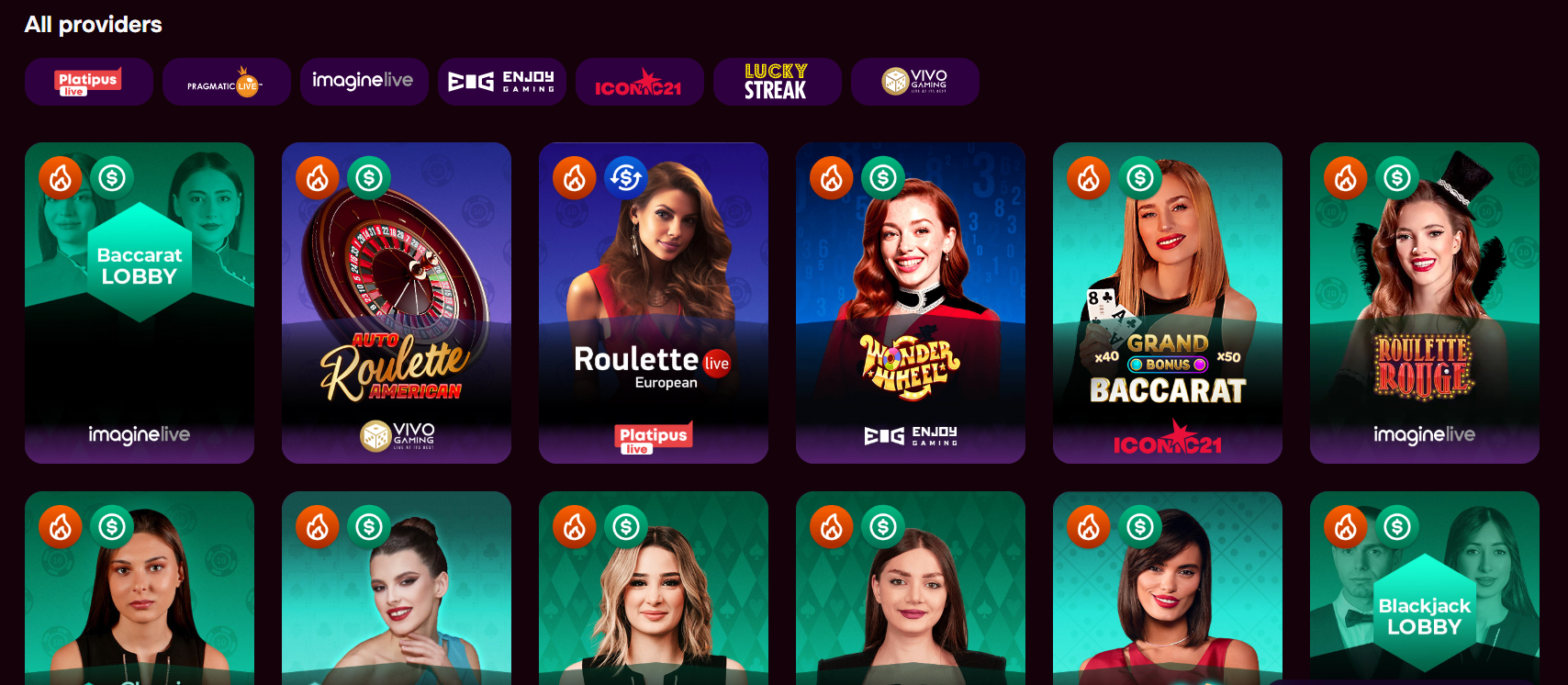
Consider how the site separates discovery from account management. Game browsing should not be mixed confusingly with payment or verification controls. In this example, the provider list has a name-search field, while lobby badges distinguish recently added, popular and jackpot-labelled titles. Bonus-related labels also identify games that qualify for bonus play or wagering contribution. Those details are useful only if they are visible before a player opens several individual games.
Next, test whether important information is available at the point of decision. Individual game rules are reportedly accessible within the games, while tournament and lottery areas have separate entry conditions and prize rules. That arrangement is preferable to presenting every rule in one long document. During an online casino comparison in Canada, note whether rules are easy to locate, written in understandable language and consistent with the labels shown in the lobby.
Can the lobby help you narrow the choice?
A large catalogue is not automatically a usable catalogue. A well-organized lobby should let readers narrow results by a meaningful category, supplier or game type. Categories such as video slots, classic-style slots, live tables, roulette, blackjack, game shows and fast-paced games can help, provided they are distinct enough to guide browsing. Separate navigation for sportsbook and esports can also reduce clutter for people interested only in casino content.
Provider search is another practical feature to compare. If you already recognize a software supplier, a searchable provider page may be faster than scrolling through the full lobby. However, supplier names should be treated as navigation aids, not guarantees about quality, return percentages or availability. The available information says individual libraries can vary by country, so the catalogue visible to one player may not match another player’s results.
Badges require similar caution. A “popular” or “new” label describes how the site organizes its lobby; it does not establish that a title offers better odds or greater value. Jackpot wording also needs to be read carefully, because a label alone does not explain the prize mechanism. A sensible comparison checks whether the game’s own rules are accessible and whether promotional eligibility is clearly distinguished from ordinary cash-play availability.
Keep account controls separate from promotions
Usability becomes more important after registration, when players need to verify details, recover access or review activity. The described profile area includes account settings, email confirmation, verification status and logout controls. Password recovery is handled from the login screen through a reset link sent to the registered email address. A comparison should check whether these functions are easy to find without contacting support for routine actions.
Promotions should have their own clear area rather than being scattered across banners. Here, bonuses are grouped under Profile and divided into states such as Available, Active and In line. That structure can help users see which offer has been activated and which is waiting. It also matters that multiple bonuses may be cleared in activation order, since the order cannot be rearranged according to the supplied terms.
Readability matters more than the number of promotional tiles. A useful interface should show the qualifying deposit, wagering requirement, expiry period, maximum payable amount and relevant game restrictions before activation. In the supplied information, bonus wagering, bet caps, validity periods and early-withdrawal consequences are material conditions. If those details are hidden behind several screens, the navigation may be attractive but still difficult to use responsibly.
Check whether payment and verification routes are obvious
Cashier navigation deserves a separate comparison because payment information is often more complicated than the lobby. The described Cashbox contains deposit and withdrawal areas, while Operations history records transactions. A clear route should make it apparent which method is being selected, whether it supports deposits or withdrawals, and whether the account is using CAD or another permitted currency. Geography alone should never be treated as proof that a particular method is available.
The supplied information lists Interac, cards, bank transfer, prepaid services, e-wallets and cryptocurrencies, but also states that the exact selection depends on the account and payment location. That qualification is important. A comparison should focus on what is displayed inside the individual account rather than relying on a general methods list. It should also distinguish an advertised funding option from a method that can necessarily be used for cashing out.
Verification should be reachable from the profile rather than appearing only when a withdrawal is attempted. The stated route is Profile, then Verification, where accepted documents and possible address or payment-method evidence are explained. Account information must remain accurate and verifiable, and payment accounts must belong to the player. For broader Canadian information about safer gambling decisions and support, consult the Responsible Gambling Council’s public resources. A convenient interface cannot replace reading the operator’s current requirements.
Test the mobile layout before relying on it
Mobile usability is not limited to whether a page opens on a phone. Check whether the main navigation remains understandable on a smaller screen, whether Cashbox and Profile are easy to reach, and whether game rules can be opened without excessive scrolling. The supplied material describes browser access on smartphones and tablets, including casino games, live tables, sportsbook navigation, account settings and promotional pages.
It also distinguishes an installable website or progressive web app from a separately verified native application. That distinction matters when comparing platforms. An “install app” prompt may simply add a web experience to the device’s home screen. Before installing anything, check what the page actually identifies, what permissions it requests and whether the same account controls remain available in the mobile browser.
Finally, compare how the mobile layout handles support and safety controls. Live chat is described as available around the clock, with email support for issues such as activation, password access, verification and withdrawals. Deposit and loss limits are available through Profile, alongside self-exclusion and account-closure options. These controls should remain findable on mobile, not be buried beneath promotional content. Good navigation means being able to locate both convenience features and restrictions when they are needed.
Questions readers often ask about casino navigation
What is the most important feature to compare first?
Start with the main route to the lobby, profile and Cashbox. If those areas are clearly labelled and easy to reach, you can usually investigate games, rules, verification and transactions more efficiently. A large catalogue matters less when basic account information is difficult to locate or separated across confusing menus.
Do provider names prove that games are suitable?
No. Provider names can make a catalogue easier to search, but they do not prove that a game has better odds, lower volatility or universal availability. Open the individual game rules and check the title’s current availability in your account. Libraries and restrictions may differ by location.
What should I verify on a mobile casino site?
Check that the mobile version provides access to game rules, profile settings, verification, transaction history, support and account limits. Also determine whether an install prompt refers to a browser-based web app or a native application. Do not assume that mobile availability confirms eligibility, payment access or every desktop feature.